We created a series of free reports to boost our lead generation and encourage people to sign up to our newsletters.
Before this project, these reports were all made as PDFs and people were sent a download link. However, the increase in mobile and tablet usage meant many customers found the PDFs difficult to view and interact with on their devices.
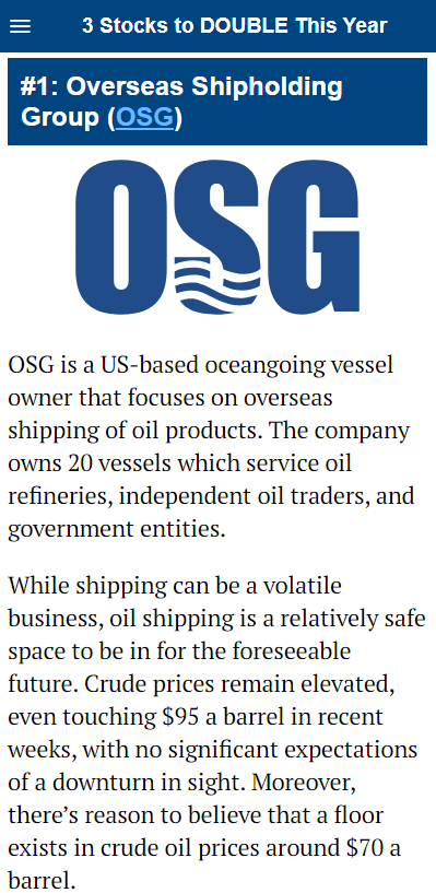
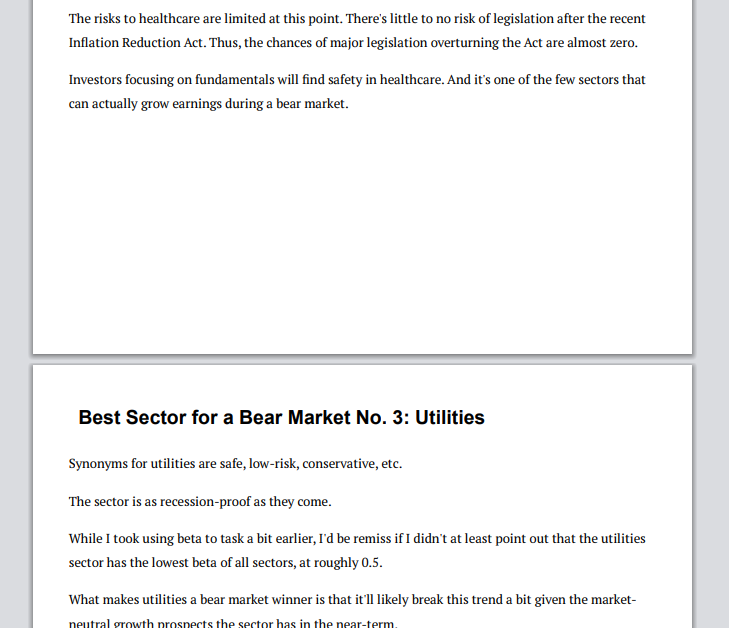
To address this issue I developed a responsive PHP and HTML template we could use to optimize the user experience for both desktop and mobile devices, ensuring a seamless reading experience across all platforms.
The template automatically adjusts if it is desktop (above) and mobile viewports.

For each report it was also necessary to create a cover. Each product being promoted had a different logo and style, so each cover had to have a unique feel while still being readable.


I also created a print only stylesheet, which took away most of the styling and changed the formatting to be more readable once printed. This stylesheet can also be used by screenreaders, which increases accessibility compared to a PDF.

